Paint Color Guide for Atlanta Homes
Trending exterior paint colors for Atlanta homes in Buckhead, Sandy Springs, and Brookhaven. Specific Sherwin-Williams and Benjamin Moore recommendations.

Popular Exterior Paint Colors for Atlanta Homes
The most popular exterior paint colors for Atlanta homes in 2026 are warm whites, soft greiges, deep navies, charcoal grays, and sage greens. Specific best-sellers include Sherwin-Williams Accessible Beige, Alabaster, Naval, and Urbane Bronze, and Benjamin Moore Revere Pewter, White Dove, Hale Navy, and Newburyport Blue. The right color depends on your home's architectural style, your neighborhood's character, and your HOA guidelines. This guide covers what is trending, what works by neighborhood, and specific color names you can bring to your painter.
Exterior paint is one of the highest-impact changes you can make to a home. It is also one of the most visible and hardest to reverse without spending money. Choosing the wrong color, or the wrong shade within a color family, is expensive to fix — whether you are planning interior painting in Atlanta or a full exterior repaint. This guide gives you specific recommendations, not vague direction, so you can choose with confidence.
Why Atlanta Homes Require Different Color Thinking
Atlanta's environment shapes how exterior paint looks and performs in ways that matter when choosing colors.
Mature tree canopy: Atlanta's famous urban forest means many homes sit under partial or full shade from oak, magnolia, maple, and pine trees. Shaded homes read paint colors differently than sun-exposed homes. Colors that look crisp and clean in full sun can look muddy or cool in constant shade. Warmer undertones in whites and neutrals help counteract the blue-green cast of shade.
Red Georgia clay: Many Atlanta properties have red clay soil and landscape elements. This earthy red undertone affects how greens, beiges, and browns read on your exterior. Colors with warm undertones harmonize with red clay better than cool gray-blues.
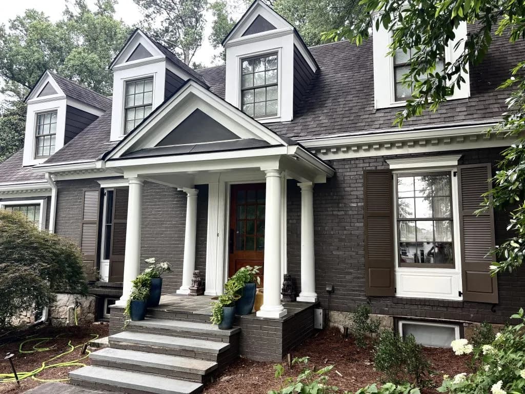
Brick and stone: Atlanta has a high concentration of homes with brick, stone, or mixed masonry. Your paint colors need to work with those fixed elements, not fight them. Cream and warm whites complement red brick. Cool grays work better with gray or white stone.
HOA restrictions: Many neighborhoods in Buckhead, Sandy Springs, Dunwoody, Johns Creek, and Alpharetta have active HOAs that restrict exterior colors to an approved palette. Always check your HOA documents before choosing a color.
Trending Colors for Atlanta Homes in 2026
Warm Whites and Creams
Warm white is the most popular exterior color in Atlanta right now. It reads clean and classic, works with almost every architectural style, and complements Atlanta's brick and stone homes.
The key is choosing a white with warm undertones, not a stark or cool white. In Atlanta's mix of sun and shade, cool whites look harsh or slightly blue. Warm whites with yellow or beige undertones look timeless.
Best options:
- Sherwin-Williams Alabaster (SW 7008): A soft, creamy white with warm undertones. Works on almost every home style. One of the most-used exterior colors in Atlanta for traditional and transitional homes.
- Sherwin-Williams Shoji White (SW 7042): Slightly warmer than Alabaster with a barely-there beige quality. Excellent on homes surrounded by greenery.
- Benjamin Moore White Dove (OC-17): A clean, soft white with just enough warmth to avoid looking stark. Very popular in Brookhaven and Virginia-Highland on traditional homes.
- Benjamin Moore Chantilly Lace (OC-65): A brighter, cleaner white for homes that need strong contrast with dark trim. More suited to homes with full sun exposure.
Greiges and Warm Tans
Greige (gray-beige) has been popular for a decade and continues to be a safe, sophisticated choice for Atlanta homes. These colors work well with the earthy tones of the Atlanta landscape and with brick foundations.
- Sherwin-Williams Accessible Beige (SW 7036): The most popular neutral in Atlanta. Warm enough to feel welcoming, neutral enough to work with almost any trim color. Works particularly well on ranch-style and split-level homes.
- Sherwin-Williams Agreeable Gray (SW 7029): More gray than beige, but still warm. Excellent on modern farmhouse and transitional-style homes.
- Benjamin Moore Revere Pewter (HC-172): A classic warm gray with a slight green undertone. It reads differently in different light, which some homeowners love and others find unpredictable. Test this one carefully on your home before committing.
- Benjamin Moore Pale Oak (OC-20): A lighter, softer beige that reads almost like a warm white from a distance. Works well on homes in neighborhoods with older, more formal architectural styles.
Deep Navies and Blues
Navy exterior paint has grown significantly in Atlanta over the past few years. It works best on homes with white or cream trim and natural wood or black accent details.
- Sherwin-Williams Naval (SW 6244): A deep, rich navy that reads true blue with excellent depth. Popular on traditional colonials and craftsman bungalows throughout Buckhead and Sandy Springs.
- Benjamin Moore Hale Navy (HC-154): A slightly grayer navy than Naval. More understated and versatile. Works well on both formal and casual home styles.
- Benjamin Moore Newburyport Blue (HC-155): A lighter, more historic blue. Works especially well on older homes with traditional detailing.
- Sherwin-Williams Indigo Batik (SW 7602): A deep blue-violet with more complexity than straight navy. Best on smaller homes where the richness of the color does not overwhelm.
Charcoals and Dark Grays
Charcoal and dark gray exteriors are a strong trend in Atlanta's newer and renovated homes. They photograph beautifully and create high contrast with white trim and natural landscaping.
- Sherwin-Williams Urbane Bronze (SW 7048): A deep, warm charcoal with brown undertones. Works better on homes surrounded by natural materials than on homes with cool stone or metal.
- Sherwin-Williams Iron Ore (SW 7069): A true charcoal that reads near-black in low light. Striking and modern. Best on homes with clean lines and minimal ornamentation.
- Benjamin Moore Soot (2129-20): A warm dark gray that works well on craftsman and modern farmhouse styles.
- Benjamin Moore Black Ink (2127-20): Near-black with a subtle warm cast. For homeowners who want a bold, dramatic exterior.
Sage Greens and Earthy Tones
Green is having a moment in Atlanta. The connection to the city's natural landscape makes green feel right in a way that it does not everywhere. Sage greens, in particular, work well with the red clay soil and heavy tree cover that define so many Atlanta properties.
- Sherwin-Williams Privilege Green (SW 6193): A muted, dusty sage green. Works beautifully on craftsman bungalows and cottage-style homes.
- Sherwin-Williams Rosemary (SW 6187): A deeper, more complex green with gray undertones. Popular on newer construction with clean lines.
- Benjamin Moore Saybrook Sage (HC-114): A classic gray-green that has been popular in New England for decades and has found its way to Atlanta's traditional neighborhoods.
- Benjamin Moore Aganthus Green (HC-211): A muted, slightly blue-green that works well on Victorian and craftsman-era homes.
Color Choices by Atlanta Neighborhood
Buckhead
Buckhead mixes formal traditional homes with modern new construction. The neighborhood's larger lots and established landscaping create a backdrop that works well with classic colors.
Traditional Buckhead homes (Georgian, Colonial, Federal): Warm whites like Alabaster or White Dove with black or charcoal shutters. Deep greens and navies for homes where the owner wants a bolder look.
Modern Buckhead new construction: Warm greiges (Agreeable Gray, Accessible Beige) and charcoals (Iron Ore, Urbane Bronze). Clean color palettes with minimal accent colors.
Sandy Springs
Sandy Springs has a mix of mid-century modern homes, traditional ranches, and newer construction. The neighborhood's tree cover is dense and the lots are generally mature.
For ranch-style and split-level homes: Greiges and warm neutrals perform well. Accessible Beige and Agreeable Gray are both popular throughout Sandy Springs.
For newer construction: Darker colors like Urbane Bronze and Iron Ore are increasingly common. Clean lines benefit from the drama of dark paint with bright white trim.
Brookhaven
Brookhaven has experienced significant new construction and renovation over the past decade. The neighborhood's character is transitional, mixing traditional homes with modern updates.
Warm whites and light neutrals are the most common choice in Brookhaven because they work with both traditional and contemporary architectural details. Naval and Hale Navy are increasingly popular on the more dramatic renovations.
Virginia-Highland and Inman Park
These older, walkable neighborhoods have a high concentration of craftsman bungalows, Victorian cottages, and early 20th-century homes. The architectural character invites more color than Buckhead or Sandy Springs.
Sage greens, deep blues, and warm earthy tones all work well on craftsman and Victorian homes. Colors with historical precedent, like those in the Benjamin Moore Historical Color collection, often look most natural in these neighborhoods.
Dunwoody and Johns Creek
These neighborhoods skew toward newer construction with more suburban character. Traditional colonial and transitional-style homes are common.
Greiges and warm neutrals are the dominant choice. Homes here tend toward larger square footage, and a classic neutral on a large home avoids the risk of a bold choice looking overwhelming.
HOA Color Approval in Atlanta Suburbs
If you live in a community with an HOA, your color choices are not entirely your own.
Many HOAs in Atlanta suburbs, particularly in Alpharetta, Johns Creek, Dunwoody, and parts of Sandy Springs, maintain approved color palettes. Some require formal approval before any exterior paint change. Some have restrictions only on the body color, leaving trim and accent colors open. Some require colors from a specific palette at a specific paint brand.
Before you choose a color:
- Check your HOA CC&Rs for any reference to exterior colors or architectural review requirements.
- Contact your HOA management company directly. Ask for the current approved color palette.
- If approval is required, submit your color choice before you schedule the work. Approval processes can take 2-4 weeks.
- Keep documentation of your approval in case there is a dispute later.
Painting without HOA approval and then being required to repaint is an expensive mistake. It happens more than it should.
Trim Color Pairings
The body of your home gets the most attention, but trim color is what gives the full look its character. Here are the most common and successful trim pairings for Atlanta homes.
White trim with any body color: Classic and virtually never wrong. Sherwin-Williams Extra White and Benjamin Moore White Dove are both clean, versatile trim whites.
Black trim with warm whites or greiges: A high-contrast combination that has become increasingly popular in Atlanta. Sherwin-Williams Black Magic or Benjamin Moore Black are strong choices.
Cream trim with deeper body colors: When your body color is a deep navy, charcoal, or green, a cream trim (rather than stark white) softens the contrast and looks more classic. Benjamin Moore White Dove or Sherwin-Williams Alabaster work well as trim on darker homes.
Matching trim: Some modern homes use the same color on both the body and trim, varying only the finish (flat on body, semi-gloss on trim). This creates a monochromatic, contemporary look that can be striking on homes with strong architectural lines.
Frequently Asked Questions
What exterior paint colors are popular in Atlanta right now?
The most popular exterior colors in Atlanta in 2026 are warm whites (Alabaster, White Dove), warm neutrals (Accessible Beige, Agreeable Gray), deep navies (Naval, Hale Navy), charcoals (Urbane Bronze, Iron Ore), and sage greens (Privilege Green, Rosemary). Warm tones perform better than cool ones in Atlanta's tree-shaded environment.
What exterior paint color works best with red brick?
Warm whites, creams, and greiges work best with Atlanta's red brick. Specifically: Sherwin-Williams Alabaster, Shoji White, or Accessible Beige. Benjamin Moore White Dove or Pale Oak. Avoid cool grays and blue-whites, which can look harsh against warm red brick.
How long does exterior paint last in Atlanta?
Quality exterior paint from Sherwin-Williams or Benjamin Moore, applied properly on a well-prepped surface, should last 7-12 years in Atlanta. Atlanta's humidity and occasional extreme heat can shorten paint life compared to drier climates. Using a top-quality product and ensuring thorough prep work are the two biggest factors in longevity.
Can I use dark exterior paint colors in Atlanta?
Yes. Dark colors like charcoal, navy, and deep green are increasingly popular in Atlanta and hold up well in the climate. The main consideration is heat absorption. Dark colors absorb more heat, which can expand and stress the paint film over time. Using a premium product engineered for exterior use and ensuring proper primer application helps dark colors last.
Do I need to tell my HOA before painting my house?
If you live in a community with an HOA, check your governing documents before you schedule any exterior painting. Many Atlanta neighborhoods require architectural review and approval for exterior color changes. The approval process typically takes 2-4 weeks.
Choosing a Color You Will Love for Years
The best exterior color for your home is one that works with your architecture, harmonizes with your landscaping, fits within any HOA requirements, and feels right to you. Color chips and online visualizers are useful starting points. Actual paint samples on your exterior wall, viewed in morning light, afternoon light, and shade, are the only way to know for certain.
OVO Painting serves homeowners throughout Atlanta, Buckhead, Sandy Springs, Brookhaven, Marietta, Roswell, and surrounding areas. We bring color expertise to every project and can help you narrow down your choices during your free walkthrough.
Call (404) 630-2720 or request your free estimate to get started.
Try Colors Before You Commit
Color chips and online swatches only tell you so much. Use our Color Visualizer to see how different colors look on real room surfaces before you commit. Upload a photo of your space and swap colors instantly. When you are ready to narrow it down, our free color consultation puts real paint samples on your walls under your actual lighting — the only way to know for certain.
White Dove vs Swiss Coffee: Choosing the Right White
The two most popular whites for Atlanta homes are Benjamin Moore White Dove (OC-17) and Benjamin Moore Swiss Coffee (OC-45). Both are warm whites, but they read differently in Atlanta's light.
White Dove (OC-17): A clean, soft white with a barely-there warm undertone. Reads bright in full sun and soft in shade. Works on both interior and exterior. The more versatile of the two — pairs with virtually any accent color. Popular across Brookhaven, Virginia-Highland, and Buckhead on traditional homes.
Swiss Coffee (OC-45): A warmer, creamier white with noticeable yellow-beige undertones. Reads cozy and inviting. Better for interiors and shaded exteriors where a cooler white would look stark. Popular in dining rooms, bedrooms, and on homes surrounded by heavy tree canopy.
The quick test: Hold both samples against a sheet of bright white printer paper. White Dove will look almost white. Swiss Coffee will look distinctly cream. If you want bright and clean, go White Dove. If you want warm and enveloping, go Swiss Coffee. Both look beautiful in Atlanta homes — neither is wrong, but they set a different mood.
LRV, Undertones, and Color Specs
White Dove has an LRV of 83.16 with yellow undertones softened by gray. Swiss Coffee has an LRV of 82.56 with yellow, green, and gray undertones. The LRV difference is less than one point — they reflect nearly identical amounts of light. The visual difference comes entirely from their undertones, not their brightness. White Dove reads as soft and clean. Swiss Coffee reads as creamy and earthy.
White Dove: Best Rooms and Pairings
White Dove holds its color well across lighting conditions. In bright natural light it looks like a crisp, soft white. In low light it stays warm without turning yellow or muddy. North-facing rooms bring out slightly more of the gray undertone; south-facing rooms warm it up without going buttery. This stability lets you use it throughout the entire home and it reads consistently from room to room.
- Kitchens: Fresh, open look. Pairs well with marble countertops, stainless steel, and natural wood. The clean undertone keeps the space feeling bright.
- Bathrooms: The slight warmth prevents the sterile feel of pure whites, while the gray undertone works well with chrome and nickel fixtures.
- Trim and millwork: One of the most popular trim colors in the country. Use it in semi-gloss on trim with eggshell on walls for a subtle, polished contrast. You can also use White Dove on both walls and trim — the sheen difference creates enough visual separation without a second color.
- Cabinets: Gives painted cabinets a warm but not yellow appearance. The gray undertone keeps cabinets looking clean and fresh. Pairs well with both warm and cool countertops and hardware.
White Dove works well as a trim color alongside Edgecomb Gray (HC-173), Revere Pewter (HC-172), Hale Navy (HC-154), and Wythe Blue (HC-143).
Swiss Coffee: Best Rooms and Pairings
Swiss Coffee is more reactive to light than White Dove. In bright, warm sunlight it can look golden and rich. In cooler or dimmer light, the green undertone becomes more visible, which keeps the color looking neutral rather than yellow. North-facing rooms can bring out a subtle sage-like quality. South-facing rooms push it warmer and creamier. Sample it in your actual room before committing.
- Bedrooms: Creates a calm, cozy feel. Soft enough to promote relaxation but warm enough to make a room feel snug rather than bare.
- Living rooms and family rooms: The creamy tone makes large spaces feel inviting and layered, especially alongside warm wood furniture and natural textiles.
- Dining rooms: The warm cast flatters skin tones and looks beautiful in evening light — a strong choice for entertaining spaces.
- Whole-house color: Swiss Coffee's warmth makes it a strong candidate for painting your entire interior. It reads consistently enough to flow from room to room while feeling more interesting than a basic white.
Swiss Coffee walls pair well with Chantilly Lace (OC-65) or Simply White (OC-117) for trim. Both are cleaner, brighter whites that create a crisp frame around Swiss Coffee's warmth. Avoid pairing Swiss Coffee with stark, blue-toned whites — the undertone clash can make Swiss Coffee look dirty.
Head-to-Head: Warmth, Versatility, and Trim
Swiss Coffee is the warmer of the two. If you want a white that clearly reads as creamy and warm, Swiss Coffee delivers. If you want warmth that is more subtle — a white that looks white but does not feel cold — White Dove is the pick.
White Dove is more versatile. Its balanced undertones make it work as a wall color, trim color, and cabinet color across different rooms and lighting conditions. Swiss Coffee is a strong wall color and whole-house color, but it is less commonly used on trim because its warmth can clash with cooler wall colors.
White Dove is also more stable across lighting conditions. Swiss Coffee shifts more noticeably between warm light (where it looks golden) and cool light (where the green emerges). If your home has a mix of lighting exposures, White Dove will give you more consistent results room to room.
How Atlanta's Light Affects These Whites
Atlanta sits at roughly 33 degrees north latitude, which means strong, warm sunlight for most of the year, especially on south-facing walls. Many Atlanta homes have south-facing rooms that get direct sun for several hours a day. In these rooms, Swiss Coffee can lean noticeably golden in the afternoon. If that warmth appeals to you, it looks beautiful. If you want something that stays more neutral throughout the day, White Dove handles strong southern light better because its gray undertone balances the warm sun.
Neighborhoods like Buckhead, Brookhaven, Virginia-Highland, and Druid Hills have heavy tree coverage. If your home sits under a canopy of mature hardwoods, your interior light is filtered and greenish. In these conditions, Swiss Coffee's green undertone can become more visible. White Dove's gray undertone keeps it looking cleaner under filtered, green-tinted light.
At OVO Painting, we paint Atlanta homes every week. The most common feedback from homeowners is simple: White Dove works best in bright, open floor plans. Swiss Coffee works best in older homes with more divided rooms and warm wood floors. Both look great — the difference comes down to your specific space.
White Dove vs Swiss Coffee: Frequently Asked Questions
Is White Dove or Swiss Coffee more popular?
White Dove is Benjamin Moore's most sampled paint color, making it slightly more popular overall. Swiss Coffee is a close second and has been a best-seller for over a decade. Both are consistently ranked among Benjamin Moore's top five white paint colors. Popularity should not drive your decision — your room's lighting and your personal taste matter more than trends.
Does Swiss Coffee look yellow?
Swiss Coffee can look slightly yellow in warm, direct sunlight, especially in south-facing rooms during the afternoon. In neutral or cooler light, the green and gray undertones balance the yellow and keep it reading as a creamy white rather than a pale yellow. Sample it in your room first. In most lighting conditions, Swiss Coffee stays firmly in the white family.
What trim color goes with Swiss Coffee walls?
The most popular trim colors for Swiss Coffee walls are Benjamin Moore Chantilly Lace (OC-65) and Simply White (OC-117). Both are cleaner, brighter whites that create a crisp frame around Swiss Coffee's warmth. White Dove (OC-17) also works for a more subtle contrast. Avoid stark, blue-toned whites — the undertone clash can make Swiss Coffee look dirty by comparison.
Can you use White Dove on both walls and trim?
Yes, and this is one of White Dove's biggest advantages. Many designers use White Dove on both trim and walls by changing the sheen: eggshell or matte on walls and semi-gloss on trim. The finish difference creates enough visual contrast without introducing a second color. This approach gives rooms a clean, cohesive look.
Which white is better for kitchen cabinets?
White Dove is the more popular choice for kitchen cabinets. Its gray undertone keeps cabinets looking clean and fresh rather than creamy or yellowed. It pairs well with both warm and cool countertops, backsplashes, and hardware. Swiss Coffee can work on cabinets in kitchens with lots of warm wood and earthy tones, but most designers reach for White Dove when the goal is a bright, modern kitchen.
Can you mix White Dove and Swiss Coffee in the same house?
Yes, but be intentional about it. A common approach is White Dove on trim throughout the house with Swiss Coffee on the walls in rooms where you want extra warmth — bedrooms, dining rooms. Keep the trim color consistent so the home feels connected. Both colors are warm whites, so they do not clash the way a warm white and a cool white would.
What is the LRV difference between White Dove and Swiss Coffee?
White Dove has an LRV of 83.16 and Swiss Coffee has an LRV of 82.56. LRV (Light Reflectance Value) measures how much light a color reflects on a scale of 0 (pure black) to 100 (pure white). The difference between these two is less than one point, so they reflect nearly the same amount of light. The visual difference you see comes from their undertones, not their brightness.
Need Help Choosing?
Your OVO Painting crew can walk you through product options and finishes during your free estimate. No obligation.
Book Your Free Estimate
Your information is secure and never shared.
Sebastian Thomas
Founder, OVO Painting
Sebastian leads every estimate and final walkthrough at OVO Painting. With hands-on experience painting homes across Atlanta, he writes these guides to help homeowners make informed decisions about their projects.
Book Estimate
Same-day response. Fixed pricing. Written warranty.
Book Your Free Estimate
Your information is secure and never shared.
Free estimate · No obligation · 175+ Google reviews
Related Guides
Best Exterior Paint for Atlanta Climate (2026 Guide)
Guide to choosing exterior paint that withstands Atlanta heat, humidity, and rain. Top products and application tips.
Read GuideLow-VOC Painting Services in Atlanta
Guide to low-VOC and zero-VOC painting in Atlanta. Health benefits, product options, and pricing.
Read GuideDrywall Ceiling Repair in Atlanta (2026 Guide)
Guide to ceiling drywall repair in Atlanta. Water damage, cracks, texture matching, and popcorn removal.
Read GuideBest Cabinet Painting Colors in Atlanta for 2026
Trending cabinet paint colors for Atlanta kitchens and bathrooms in 2026. Color recommendations by style.
Read GuideWallpaper Removal Services in Atlanta (2026 Guide)
Professional wallpaper removal in Atlanta. Costs, process, wall repair, and when to DIY vs hire a pro.
Read GuideInterior and Exterior Painting in Atlanta: Combined Project Guide
Guide to combining interior and exterior painting in one Atlanta project. Savings, scheduling, and what to expect.
Read GuideCabinet Refinishing vs Painting in Atlanta: Which Is Right for You?
Side-by-side comparison of cabinet refinishing vs painting in Atlanta. Cost, durability, timeline, and best use cases.
Read GuideBathroom Cabinet Painting in Atlanta (2026 Guide)
Complete guide to bathroom cabinet painting in Atlanta. Costs, moisture-resistant finishes, and process.
Read GuideHow to Choose a Painting Contractor in Atlanta (Complete Guide)
Step-by-step guide to finding, vetting, and hiring a painting contractor in Atlanta. Checklist for licensing, insurance, estimates, and red flags.
Read GuideKitchen Cabinet Painting Cost in Atlanta (2026)
Kitchen-specific cabinet painting costs in Atlanta for 2026 by kitchen size, cabinet count, and finish type.
Read GuideWallpaper Installation Cost in Atlanta (2026 Pricing)
Wallpaper installation pricing in Atlanta for 2026 by material type, room size, and complexity.
Read GuideCommercial Painting Cost in Atlanta (2026 Guide)
Commercial painting pricing for Atlanta offices, retail, warehouses, and multi-unit buildings in 2026.
Read GuideDrywall Repair Cost in Atlanta (2026 Pricing Guide)
Complete drywall repair pricing for Atlanta homes in 2026 by damage type, patch size, and project scope.
Read GuideInterior Painting Cost Per Square Foot in Atlanta (2026)
Per-square-foot interior painting pricing for Atlanta homes in 2026 by room type, paint quality, and finish.
Read GuideWhole House Painting Cost in Atlanta (2026 Pricing)
How much does it cost to paint an entire house in Atlanta? Interior and exterior pricing for 2026 with room-by-room and square footage breakdowns.
Read GuideExterior House Painting Cost in Atlanta (2026 Guide)
How much does it cost to paint the exterior of a house in Atlanta? Complete 2026 pricing by home size, siding type, and number of stories.
Read GuideCabinet Painting Cost in Atlanta (2026 Pricing Guide)
Complete breakdown of cabinet painting costs in Atlanta for 2026. Kitchen and bathroom pricing by cabinet count, finish type, and project scope.
Read GuideBathroom Painting: Best Paint, Prep, and Cost
Guide to bathroom painting including best paint types, prep requirements, and cost for Atlanta homeowners.
Read GuideCeiling Painting: When, Why, and How Much It Costs
Guide to ceiling painting including cost, best finishes, and when Atlanta homeowners should repaint ceilings.
Read GuideTrim Painting: Cost, Prep, and Professional Results
Guide to trim painting cost, best paint products, and prep for Atlanta homeowners.
Read GuideAccent Wall Painting: Ideas, Colors, and Cost
Guide to accent wall painting including color ideas, cost, and design tips for Atlanta homeowners.
Read GuideKitchen Cabinet Painting: Cost, Process, and Results
Guide to kitchen cabinet painting cost, process, and how it compares to replacement for Atlanta homeowners.
Read GuidePopcorn Ceiling Removal: Cost, Process, and What to Expect
Complete guide to popcorn ceiling removal cost, process, and timeline for Atlanta homeowners.
Read GuideHouse Painting Cost: What Atlanta Homeowners Actually Pay
Complete house painting cost guide covering interior and exterior pricing for Atlanta homes.
Read GuideExterior House Painting Cost: Atlanta Pricing Guide
Exterior house painting cost guide with Atlanta-specific pricing by home size, siding type, and condition.
Read GuideBrick Painting: Cost, Pros and Cons, and Process
Guide to brick painting including cost, process, and when painting brick is the right choice for Atlanta homes.
Read GuideMatte vs Satin Paint: Which Finish Gives Your Walls the Right Look?
Matte vs satin paint finish: which one is right for your walls? Compare sheen, durability, and the best rooms for each. Clear advice from professional painters.
Read GuideInterior Painting Costs in Atlanta: Room-by-Room Pricing
Interior painting in Atlanta costs $300-$1,800 per room. Get room-by-room pricing, cost factors, and tips from professional Atlanta painters.
Read GuideBest Paint Sheen for Every Room in Your Home
Which paint sheen is best for bathrooms, kitchens, and bedrooms? Compare flat, eggshell, satin, and semi-gloss finishes with room-by-room advice from Atlanta painters.
Read GuideHow Much Does a Painter Charge? Atlanta Pricing Guide
How much does a painter charge per hour in Atlanta? Interior painting costs $300-$1,800 per room. Get detailed pricing breakdowns from professional Atlanta painters.
Read GuideSatin vs Semi Gloss Paint: Which Finish Belongs in Each Room?
Satin vs semi gloss paint: see the real differences in sheen, durability, and where to use each finish. Room-by-room guide from professional painters.
Read GuideWhite Dove vs Swiss Coffee: Which Benjamin Moore White Is Right for Your Home?
Compare Benjamin Moore White Dove OC-17 and Swiss Coffee OC-45 side by side. See undertones, LRV, best rooms, and which warm white works in your space.
Read Guide
“Every project gets my personal attention — from the first phone call through the final walkthrough.”
— Sebastian Thomas, Owner